benefits of subtitles in video
4 Reasons of How Progress Bar Can Create Powerful Business Image
If you really don’t see a proof, indicator, or progress bar that shows the percentage of work being done, can you trust the quality of service delivery? We human beings like to see the value of the real work, seeing it getting done, even if the end results are as same as expected.
There is an operational transparency feature called completeness meter or progress bar to inform the users of how close they are to getting the task done by showing the percentage of completion.
The spinning wheel and time tracking software indicators of how far your Uber driver is or in what minutes your food delivery guy will be delivering your food are the pointers to estimate the delivery time. Moving progress bars are the source of authentication or an accurate representation of work being done.
The indicator bars simply give the impression that something is happening behind the scenes. They offer us some sense that we are not waiting for something to happen in vain.
A little flashback to users’ responses to the progress bar
Harvard Business School’s professor, Ryan Buell, highlighted the fact that illusions can divert your users away and how operational transparency can help you gain the trust of your users. He supported his logic with the research survey that those restaurants have 22% higher ratings where chefs can be seen working and preparing food in the kitchen. Seeing our food being prepared in front of us gives us more anticipation, which means we enjoyed and trust the end-result product.
Progress bar shifted the same effect to the digital world. We deem the search engines that offer more transparency of work offer more accurate information to the users’ queries. Without indicator bars, people don’t get to know when the services will be delivered to them. It often creates a frustrating experience leading to potential fluctuations in sales.
The psyche behind the invention of the progress bar
The progress bar estimates the progress based on the average of the machine. Therefore, progress may vary from machine to machine. The idea behind the invention of the scroll bar wasn’t just the accuracy of the estimation. The designers wanted to create an experience through an illusion to influence the decisions of the users.
- A progress bar can make users into valuing the services more
- Progress bars increase survey satisfaction
- Progress bars increase engagement
How do progress bars play a powerful role for engagement?
It is because users are more driven to:
- Create goals
- Accomplish goals
According to research studies conducted by Dr. Hugo Liu from MIT, human beings seek the need of completeness. The human brain releases a massive quantity of endorphins when we complete a task. This is likely to be a reason we feel happier over the sense of achievement after finishing a task.
Incomplete tasks stay stuck in our brains until they are not done. Our attention is held to the envision of seeing work being done, while incomplete work causes tension.
Therefore, indicator bars are designed to remove the tension and the negative reinforcement. Both effects are developed into scroll bars. With the progress bars, we can achieve a sense of completeness (positive reinforcement) and remove tension (negative reinforcement) simultaneously.
In the book, Rules of Play, Dr. Katie Salen explains that the scroll bar plays a significant role in making meaningful decisions. The business world can use a progress bar to hold the attention and enhance delivery value.
Examples of progress bars in the web applications world
Progress bars fill the digital world with higher conversion rate responses received from users.
Here are some exciting examples of success stories of higher engagement levels leading to building strong social marketing campaigns.
LinkedIn uses gamification mechanism as progress bar to boost engagement.
LinkedIn is all about users. LinkedIn used a brilliant completeness bar to make the users fill out their career information.
A few years ago, LinkedIn failed to make their users complete their profiles.
In order to create more engagement inside the business network, all profiles were needed to be completed as much as possible. It was necessary to enhance data quality, networking strength and boost user satisfaction. The plan failed because users didn’t see the importance of filling out their profiles, and most of the profiles looked like a patchwork carpet.
Therefore, to increase engagement, LinkedIn used a brilliant progress bar. They used this simple yet effective tool as a reward. All the members who have successfully completed their virtual profiles receive a badge-they are now superstars.
The image below displays the indicator bar and the badge the members receive on filling out their professional information.

The indicator of 20% completed profile motivates to complete the profile to become a full-fledged professional. Through the progress bar, LinkedIn was able to boost the rate of complete profiles up to 55%.
Netflix—used a progress bar, hoping it to be Nike Swoosh.
Netflix is all about making good content. When it comes to social engagement and Netflix’s aim to make it the first-ever global brand campaign, they dug deep down into the audience psyche. The only obstacle was how to make the streaming experience smooth for everyone. As everyone has different choices on steaming based on their taste.
To enhance the streaming experience led the progress bar to emerged as the potential symbol of Netflix. Netflix already has the powerful iconographic symbol of N of Netflix and of course, the initiating sound of ‘Duh-dunnnnnnng’
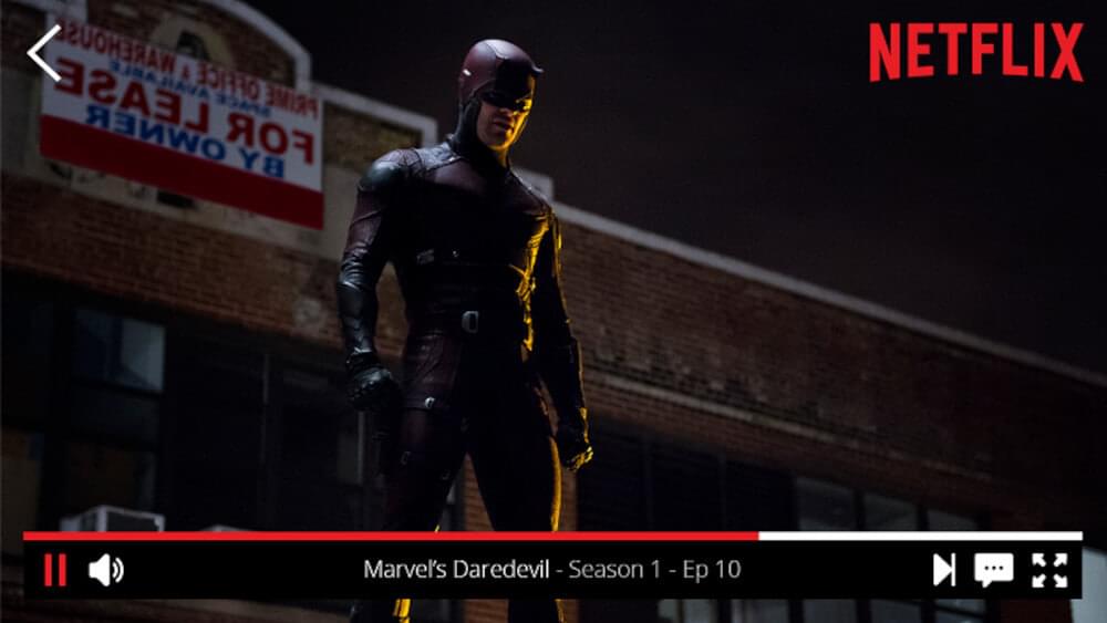
Now Netflix wants to build a scroll bar to make the journey of each viewer metaphoric. Progress bar played a significant role in increasing the goodwill of the audience to streaming. From then onwards, Netflix has been focusing on building unmatched streaming strength to represent itself as a more robust global brand.
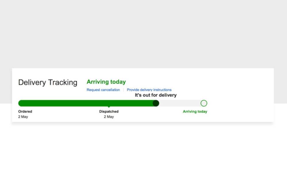
Amazon’s delivery progress bar
Imagine the level of happiness you have ordered a couple of favorite things and patiently waiting for them to appear on your doorsteps. Tracking your order being processed gives you a sense of satisfaction that sooner you are going to receive your goods.
Adding a tracking bar to the product delivery process can enhance the engagement level of users. The important thing is the authenticity of the progress. Often tracking bars don’t get updated automatically and stay stuck in one place. The unresponsive tracking bars can be misleading and divert your users away.
Spotify song scrolling bar ft. Stranger Things
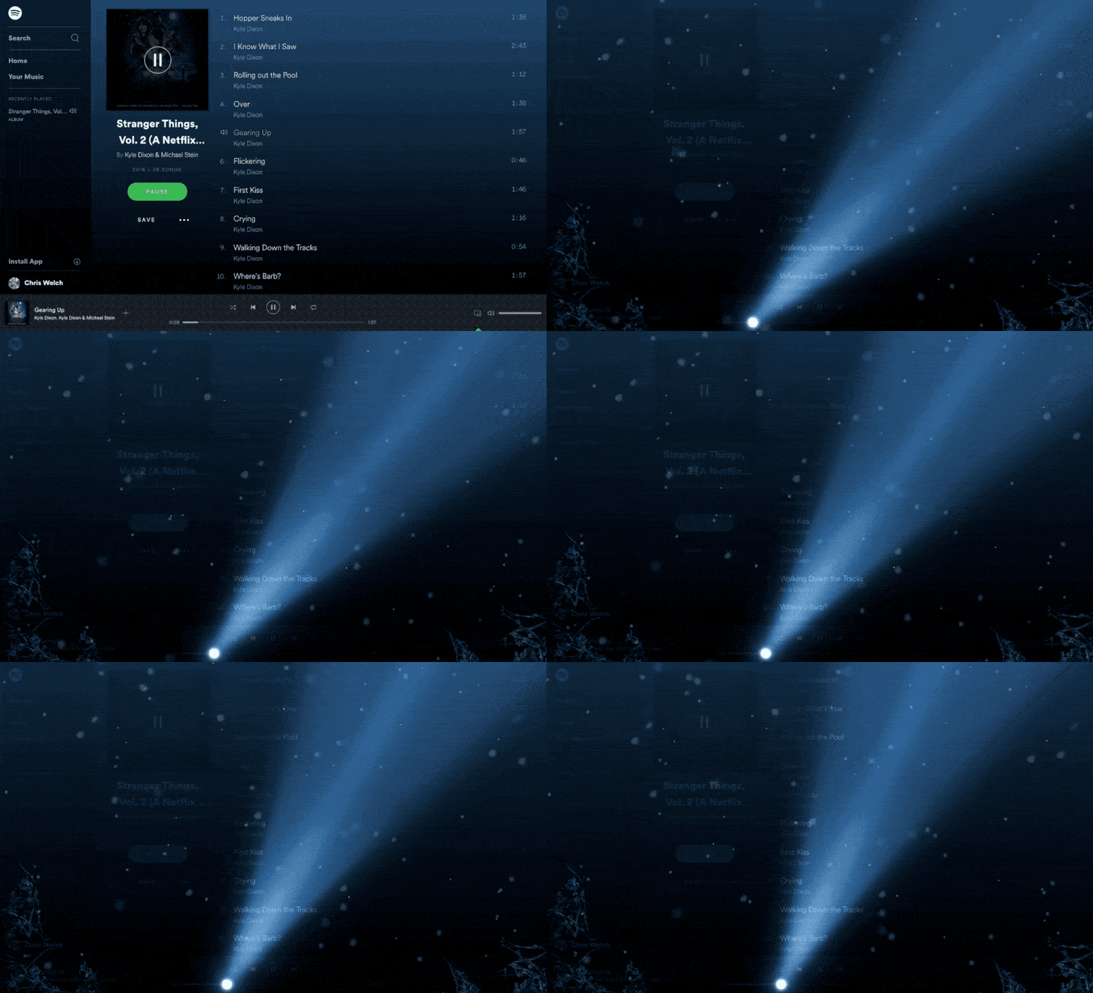
You will realize the power and sense of liberty of the progress bar if you are using a free account of Spotify. Yes! The scrolling bar isn’t free on Spotify.
A little while ago, Spotify added Stranger Things and This Easter Egg. The UI design makes a light beam move upside-down slowly as the song plays. This feature is not available anymore, but it’s a good inspiration to use for your brand.
SubtitleBee—track how close you are to getting your subtitles done with the progress bar.
SubtitleBee is all about making good content accessible for its users. Although getting your subtitles done in a few minutes with 90% accuracy in 100+ different languages, SubtitleBee is the wisest choice for content creators. But when it comes to delivering a meaningful experience to our users, offering them operational transparency over how far they are closed to get their videos subtitled—was the legit need of our users.
Scroll bar was proved to be a new powerful way to keep our users informed. Based on different video sizes, the progress indicator estimates the time of the completion of the subtilizing process. It keeps the persistent visualization of the video progress to keep the users in the loop and make them more involved through the process.
Although SubtitleBee played a frontline role in education, the digital and business world created good content instantly and made it accessible to worldwide audiences. After living through the notable journey, making our customers more involved was necessary. Therefore our development teams kickstarted their task aiming to create a subtitling journey more transparent and visible.
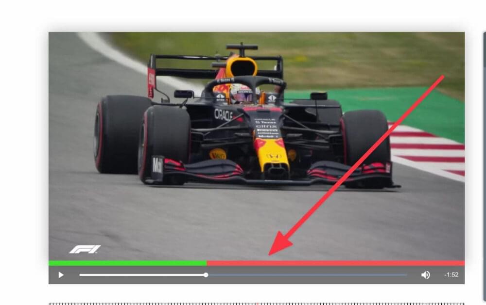
The reasons why your business should use progress bars?
It can be used to improve retention, productivity and achieve better end results. It is key to driving customer engagement and making better business decisions.
1. Real-time visibility to make better business decisions.
Happy customers are those who don’t feel they are being left out or things have been kept hidden from them. Churnfree mentions UI as one of the reasons of customer loyalty in their latest blog What is the most direct cause of customer loyalty The persistent visualization of the progress makes the user more involved in the process. The real-time visibility and transparency broaden their vision about the product delivery. Besides, their most crucial business decisions depend on product delivery. The absence of product progress knowledge can greatly impact their essential business decisions.
2. Less transparency often leads to abandonment.
The more real-time invisibility, the higher the user conversion level it is going to be. On the contrary, the vague delivery updates often lead users to leave services unfinished. 3.
3. Enrich the customer journey.
The progress bar is simple yet effective to make the user part of the product progress journey. For SubtitleBee users, calculating the video sizes and knowing the time estimation can help them plan their content creation activities better. SubtitleBee scrolling bar can significantly help them save their time and motivate them to spend their valued time on other essential things.
4. More enhanced user experience.
Countless research studies highlighted the positive human behavior over the successful completion of the task. It plays a significant role in boosting the motivation level, enhancing productivity, and increasing user experience. Incorporating a progress bar feature into your business can transform the most ordinary task into more fun-making your audience more engaged. Hence, the progress bar plays the role of a rescue bar before the tasks become boring and frustrating.
Final thoughts and tips
In a nutshell, users want a progress bar, and your business will benefit from it if you integrate the progress bar into your apps and websites. We would like to offer you a few tips if you are excited to create a scroll bar for your brand.
- Use analytics: Using analytics is important. You would need analytics to see where most users abandoned, the point of maximum traffic, and at what point users need help. It’s important. Using analytics would help you help your users.
- Make meaningful missions: Although the progress bar is powerful and rewarding, you should continue to provide interesting targets for users. Don’t ask for unnecessary things. For instance, you can ask them to upgrade your account.
- Add rewards: Adding rewards can effectively grab the attention of the users. Simultaneously, rewards are necessary to make users complete their mission. LinkedIn awarded its users for receiving opportunities after the users. Can you create a reward something like that?
Add and translate your subtitles to more than 100 languages with high accuracy


