video tutorials for social media
Best Subtitle Font Ideas in 2025
You might be surprised to know that over 80% of people who use captions and subtitles are not deaf or hard of hearing. They are watching in sound-sensitive environments, learning new languages, or are simply reading along while they watch. This helps us understand how important subtitles and subtitle font are and how viewers consume video content across every platform in 2025.
Subtitling a video started as a tool basically for accessibility, but it has evolved into a mainstream preference now. Whether someone is scrolling through Instagram on their lunch break, catching up on a show during their commute, or watching content in their second language, captions and subtitles have become the default rather than the exception.
Why choose the right subtitle font?
Good subtitling depends upon choosing the right subtitle font for your video. This is because the style and readability of text can completely change how viewers will experience your content.
Think about how quickly poorly chosen fonts can make viewers squint or worse, click away from your video entirely. On the flip side, your well-designed subtitles will feel invisible in the best way possible because they will not pull attention away from what’s happening on screen.
The technical side matters too. Accessibility regulations like the Americans with Disabilities Act (ADA) require captions. Therefore, choosing readable subtitle fonts is what will ensure that your content reaches everyone in your audience and also meets the legal standards.
In this guide, we will break down the 5 best subtitle fonts in 2025, looking at different types of styles and showing which fonts work best for each. Along the way, we will also highlight SubtitleBee’s font collection so you can see which ones are perfect for your projects.
5 Best Subtitle Fonts in 2025
When it comes to choosing subtitle fonts, some options rise above the rest due to their combination of readability, versatility, and widespread availability. These five fonts have proven themselves across millions of videos and continue to be the go-to choices for content creators who prioritize viewer experience.
1. Roboto
Roboto typeface was originally designed for Google’s Android interface. Its letters look mechanical yet friendly and look clear across all screen sizes and resolutions. The font has slightly squared shapes with open curves that look best even at smaller sizes.
SubtitleBee includes Roboto in its font collection giving you a professional subtitle font option for your video subtitles.
2. Helvetica
Helvetica typeface has clean lines and a neutral appearance. Helvetica has tight letter spacing and allows more words per line for good caption readability. This makes it a good choice for movies and TV shows with dense dialogue.
3. Arial
Arial has widespread availability across all operating systems. Arial typeface characters have slightly fuller letterforms yet they are very simple. Arial works well for educational content, interviews, and professional videos where you want subtitles to be functional rather than stylistic.
4. Verdana
Verdana is a serif typeface. Its letterforms are wider and have a larger height than many other serif fonts which makes the letters easier to read on screens over videos. The font has open counters and generous spacing between characters. Verdana works well for long-form content like podcasts and educational videos.
5. Montserrat
Montserrat has a slightly geometric aesthetic to subtitle design. The letterforms are clean and distinct therefore, its characters are easily recognizable. Montserrat is popular on social media platforms like Instagram and TikTok. The font works beautifully for brand marketing. SubtitleBee also offers Montserrat as part of its font library.
Seasonal Pick: Halloween 2025
Best subtitle fonts for Halloween Videos:
- Ravi Prakash - playful, Halloween vibe; great for short hooks (SubtitleBee)
- Macondo Swash Camps - ornate, vintage swash display with a whimsical/occult vibe (SubtitleBee)
- Creepster - classic B‑movie jagged title (Google Fonts)
- Butcherman — extreme zombie/gore (Google Fonts)
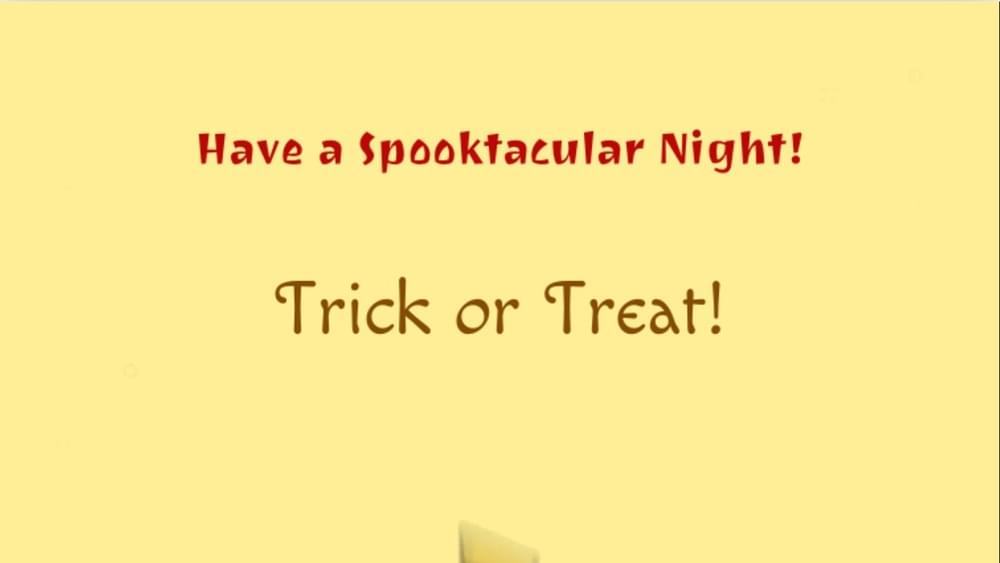
Ravi Prakash gives your titles a playful, spooky vibe that’s perfect for Halloween promos and hooks. Use it for short accents, Supertitles, titles, speaker tags, or CTAs ,and keep your continuous captions in a clean sans‑serif for readability (Inter, Source Sans 3, or Noto Sans).
Best Subtitle Fonts for Movies
Subtitles in movies need to be easy to read. They should not distract viewers from the scene and must remain clear even during action scenes or dimly lit backgrounds.
Popular choices for movie subtitles include Helvetica, Arial, and Open Sans. Helvetica and Arial are movie industry classics. Open Sans is a more modern option because it offers softer readability.
For those using SubtitleBee, strong options include Roboto, Montserrat, Catamaran, Ubuntu, and Literata. These fonts provide a cinematic feel while staying professional. These are some of the most popular fonts, but you can get access to 350+ unique fonts in SubtitleBee’s Business plan.
For movie subtitles, use 18-24 font size for home viewing, going up to 28-32 points for larger screens. Stick with white text on a black outline or background. Position subtitles in the lower third of the screen, keeping them at least 5-8% away from the bottom edge to avoid cropping.
Best Subtitle Fonts for Interviews
Interviews often deal with important conversations where every word counts. The subtitle font for interviews should look professional and polished so that the viewers of the interview video can follow along without being distracted by stylistic flourishes.
Commonly used fonts are Lato, Verdana, and Times New Roman. Lato has a human-friendly style and Verdana’s wide letters make it readable even on mobile. Times New Roman adds formality for documentary-style interviews.
From SubtitleBee’s collection, Roboto, Poppins, Maven Pro, Ubuntu, and Montserrat are excellent picks. These fonts are modern and reliable and are ideal for corporate or formal interviews.
Try using 16-20 font size for professional interview subtitling with white text and black outline or a semi-transparent black background box. Position subtitles at the bottom center.
Best Fonts for Podcast Subtitles and Transcriptions
Podcasts with subtitles or full transcriptions need fonts that are comfortable to read over long stretches of text. The focus is on flow and readability rather than style.
Widely trusted fonts include Open Sans, Noto Sans, and Calibri. Open Sans has a friendly and balanced look, whereas Noto Sans supports multiple languages (perfect for podcasts with diverse speakers). Calibri provides soft readability across devices.
SubtitleBee fonts such as Catamaran, Imprima, Noto Sans, Montserrat, Poppins, Voces, and Voltaire work beautifully for podcast subtitles. They have strong letter spacing and readability. Subtitlebee supports the popular Noto Sans font for podcasts and transcription subtitling in different languages.
Use 14-18 font size for comfortable reading during extended viewing of podcasts.
Best Subtitle Fonts for Netflix
Streaming platforms like Netflix require fonts that are versatile and adaptable across TVs, laptops, and mobile screens. These subtitles must match Netflix’s premium feel.
Some of the best choices are Helvetica Neue, Roboto, and Montserrat. Helvetica Neue is sleek and widely used in streaming, Roboto is a modern classic, and Montserrat adds a bold look.
If you are using SubtitleBee, consider Roboto, Montserrat, Ubuntu, Literata, Poppins, and Volkorn SC. These fonts are both elegant and readable and ensure that your viewer gets professional subtitle viewing experience.
Use 20-26 font sizes to accommodate various screen sizes. Center alligned white text with black outline is industry standard for streaming platforms.
Best Subtitle Fonts for TikTok, Reels and Instagram
Social media is fast-paced and so its subtitles need to be bold. They must match the content style and target audience’s taste.
Great options for social media include Tahoma, Futura, and Bebas Neue. Tahoma works well on small screens, Futura is trendy and geometric, and Bebas Neue is bold and highly readable.
On SubtitleBee, fun and stylish fonts like Pacifico, Permanent Marker, Indie Flower, Rabar14, Maven Pro, Kranky, Yesteryear, and Voces shine. They bring energy to your video captions and make them look unique in crowded feeds.
Use 20-28 font size for mobile-first viewing. Experiment with bold colors like white, yellow, or bright accent colors with thick black outlines (3-4 pixels) for maximum pop. Center subtitles in the middle or upper-middle area to avoid being covered by UI elements like profile icons and captions.
Best Subtitle Fonts for YouTube Videos and Vlogs
YouTube content can vary widely. It can be a casual Vlogs or a detailed tutorial. Subtitle fonts can help create a balance between readability and style of the content.
Popular subtitle fonts for YouTube include Open Sans, Arial, and Noto Sans. Open Sans is versatile, Arial is dependable across devices, and Noto Sans works well for multilingual channels.
SubtitleBee’s picks for YouTube include Roboto, Poppins, Montserrat, Pacifico, Indie Flower, Voces, and Satisfy. These fonts give creators flexibility, whether they want a clean, professional look or something more playful.
Use 18-24 font size for standard YouTube viewing. White text with black outline is the safest choice. Position subtitles at the bottom-center with 10% margin.
Best Subtitle Fonts for YouTube Shorts
With YouTube shorts, subtitles must be bold and quick to read. This is because viewers only have a few seconds and a vertical screen to catch text before the next scene.
Some of the most effective fonts here are Bebas Neue, Impact, and Verdana. Bebas Neue is bold and stylish, Impact makes text pop instantly, and Verdana remains clear on mobile screens.

SubtitleBee options like Poppins, Montserrat, Roboto, Pacifico, Permanent Marker, Indie Flower, and Rabar14 are great for Shorts. They help text grab attention while staying legible in fast-paced videos.
Use 22-30 font size for better readability on mobile devices. Bold, high-contrast colors are best for YouTube Shorts. Position subtitles in the center or upper-center area to avoid YouTube Shorts UI elements at the bottom.
Also read: How to add captions and subtitles to YouTube Shorts?
Best Subtitle Fonts for Corporate & Educational Videos
Corporate training, e-learning, and professional presentations call for fonts that project seriousness and credibility. The same goes for educational videos. And it is expected that the subtitle fonts of these videos look formal and support the tone of the content.
Commonly chosen subtitle fonts for corporate and educational videos are Times New Roman, Lato, and Verdana. Times New Roman conveys professionalism, Lato gives a modern look, and Verdana is extremely readable.
SubtitleBee fonts such as Roboto, Poppins, Catamaran, Literata, Martel, Volkorn SC, and Ubuntu work well here. They give corporate content a polished and authoritative look.
Best Subtitle Fonts for Cartoons & Animated Videos
Children’s content benefits from fonts that are lively and fun. They should look playful while still being easy to read quickly.
Popular subtitling fonts for kids’ videos include Comic Sans MS, Fredoka One, and Bebas Neue. Comic Sans gives childlike style to subtitles, Fredoka One has rounded edges that look friendlier, and Bebas Neue works well for bold, colorful animation.
From SubtitleBee, fonts like Kranky, Indie Flower, Maiden Orange, Ribeye, Lovers Quarrel, Aladin, Ravi Prakash, and Macondo Swash Caps add personality and excitement to kids’ shows – especially the animations.
Try to use 20-26 size font so young viewers can read easily. Bright, fun colors like yellow, pink, or light blue for subtitles work well with thick black outlines (3-4 pixels) or colorful background boxes.
Best Fonts for Multilingual Subtitles
For multilingual content, fonts must support different alphabets and symbols while staying readable. This is the key to hit global accessibility via effective and useful subtitling.
Top picks include Noto Sans, Arial Unicode, and Roboto. Noto Sans supports a wide variety of scripts, Arial Unicode offers compatibility, and Roboto balances style with clarity.
SubtitleBee’s strong multilingual options are Sawarabi Mincho, Alif, Roboto, Poppins, Montserrat, and Volkorn SC. These fonts handle diverse languages efficiently.
Use 16-22 font size with right spacing, and test the subtitle font for support of any special characters / phonetics of the actual video language.
Best Subtitle Fonts for Anime
Anime subtitles are unique because they pass on emotion and style along with translation. Fonts must be expressive but not overwhelming.
Commonly used anime subtitle fonts include Helvetica, Arial, and Open Sans. Helvetica and Arial are clean enough to handle fast dialogue, while Open Sans adds a smoother and more modern look.
SubtitleBee fonts that suit anime include Sawarabi Mincho, Permanent Marker, Rabar14, Poppins, Montserrat, Pacifico, and Indie Flower. These options bring energy and personality without losing readability during action-packed anime scenes.
Use 18-24 size for rapid dialogue changes. White or yellow text with black outline are best for busy anime backgrounds. Position subtitles at the bottom, but you can be flexible. Some anime fans prefer yellow subtitles as a stylistic choice.
Best Fonts for Closed Captioning (CC)
Closed captions (CC) are designed for accessibility especially for deaf or hard of hearing people. So, subtitle readability is the number one priority. Fonts must be clear, large enough, and supportive of viewers with different needs.
The most effective caption fonts include Verdana, Tahoma, and Arial. Verdana and Tahoma have wide, open shapes that make text easier to read, while Arial is a familiar choice supported everywhere.
SubtitleBee provides excellent options like Roboto, Poppins, Ubuntu, Montserrat, Catamaran, Literata, and Volkorn SC. These fonts balance subtitle style and its accessibility and therefore are a reliable choice for captions.
Use 18-24 subtitle size with white text on a solid black or dark gray background box is preferred. Position subtitles at the bottom center with at least 10% margin from edges as per WCAG accessibility guidelines.
Which Subtitle Fonts are Best Used for Style?
Some fonts are beautiful and are popular for how they give a style to subtitle text. They might not be very practical for long video dialogues but they do look fancy and stylish on the screen. These work better as title cards, intros, or design accents.
Examples include Lovers Quarrel, Yesteryear, Ribeye, Macondo Swash Caps, Aladin, and Stint Ultra Condensed. Since they are expressive and decorative, they are considered perfect for branding or creative use.
How to Choose the Right Subtitle Font?
Selecting the perfect subtitle font is not complicated. Here is what you need to consider:
- Match your content type: Different content demands different font personalities. Match the font style to your video’s purpose.
- Understand your platform: Where your video lives matters. Know your platform thoroughly.
- Know your audience
- Think about video pacing Fast-paced content with quick cuts needs instantly readable fonts, so choose the subtitle font accordingly.
- Test for readability Always preview your subtitle font for different devices. A font that looks great on your laptop might be unreadable on a phone. Check it against light and dark backgrounds of the entire video.
- Prioritize accessibility If your content needs to reach the widest audience possible, choose fonts with excellent legibility and avoid using decorative fonts.

FAQs
Which font is Netflix subtitles?
Netflix often uses Helvetica Neue, though Roboto and Arial are also popular in streaming.
What font is classic film subtitle?
Classic films often relied on Helvetica, Arial, or Times New Roman for their subtitles, giving them a timeless, neutral appearance.
Which font is good for subtitles?
The best subtitle font depends on context. For general use, Roboto, Helvetica, and Open Sans are considered the most reliable.
What does 12-point font mean?
A 12-point font refers to the size of the text. One point equals 1/72 of an inch, so 12-point text is about 1/6 of an inch tall.
What are the yellow subtitles?
Yellow subtitles are a subtitle font style that is used for better subtitle visibility on screen. They are prominent against darker backgrounds and are common in older films and DVDs.
Add and translate your subtitles to more than 100 languages with high accuracy


